Meet Mike.
Digital Marketing Case Study for Voice Actor & Illustrator.
%
More Engagement
%
Audience Growth

Meet Mike.
Michael Cosh is a voice actor, comedian, and animator based out of Toronto. Over the years, Mike has lent his voice talents to hundreds of projects, been a background actor in many feature films and lately has taken to fine-tuning his skills as an animator.
%
Engagement Growth
More Followers

Meet Mike.
Michael Cosh is a voice actor, comedian, and animator based out of Toronto. Over the years, Mike has lent his voice talents to hundreds of projects, been a background actor in many feature films and lately has taken to fine-tuning his skills as an animator.
As Mike began to develop early in his career, his work began to get more and more attention. Before long he found himself wondering how best to manage his online presence. Mike reached out to the team at Grapevine Media and scheduled an initial consultation to discover what opportunities might be available for his work to grow.
Here is what we helped him to discover;
Problems We Encountered
- No brand to unify his professional talents
- DIY Website would no longer serve him well
- Didn’t have much time for social media
Branding & Logo Design for a Voice Actor
After brainstorming a few different concepts for Mike’s Brand, we settled on a super-hero style brand theme with comic book style graphic elements. The logo for Mike would be a “Character Logo” which would feature a hero character based off Mike’s appearance, called the“V-O Hero” (voice-over hero).
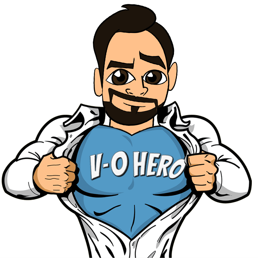

Logo Mockup
Mike worked with our team to develop a hero vector logo using an existing character illustration of himself. We customized this illustration and combined it with some vector elements to produce his initial logo. This allowed us to very quickly turn Mike’s logo concepts into a high quality vector image he could use throughout his digital presence.
Graphic Design Elements
We were able to customize some stock vector elements to use with Mike’s new brand. We cropped, re-coloured and arranged these comic action elements and prepared them for use on his website and social media.




Website Design and Development
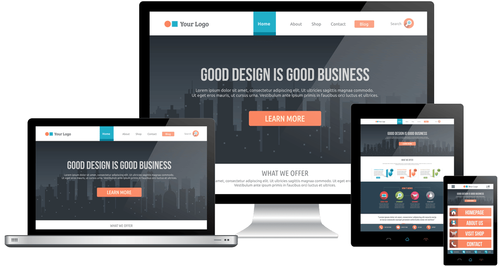
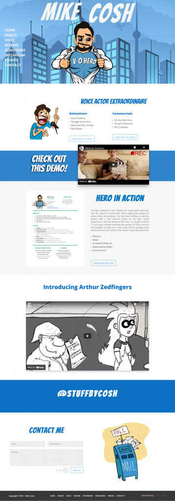
Now that Mike had a clear idea of his brand and theme, it was time to transform his website. We developed an interactive superhero-themed website featuring the “V-O Hero”, a vector-drawing characterization of Mike, and paired it with a captivating header image with some simple animations to help his site stand out. The rest of the site is dedicated to the work Mike had done for clients in the past, and showcases some of his own special projects.
The end result was a simple one-page site full of demos, downloads, and illustrations that lead visitors to the contact form at the very bottom – perfect for lead generation! To top it off we helped Mike get his website up and running on Managed WordPress Hosting with website security & maintenance included.
Social Media Marketing for an Illustrator
🛠️ New Opportunities
👍 New Followers
%
⬆️ Engagement Rate
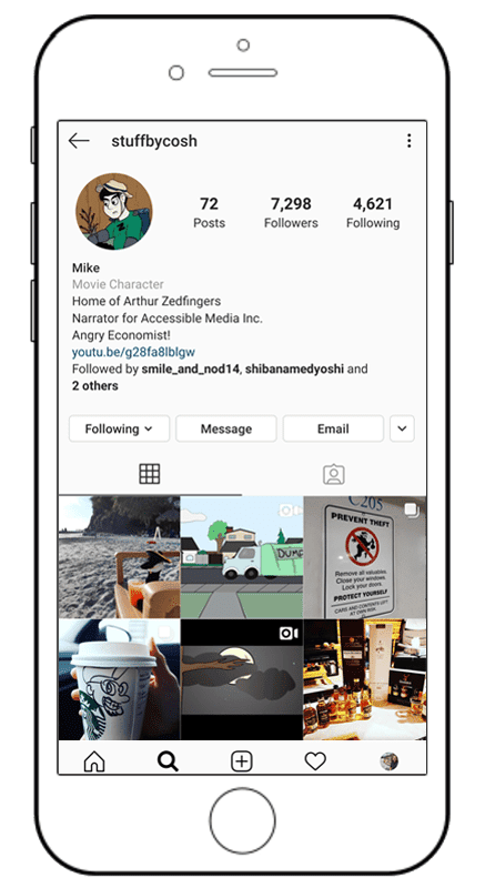
Using our marketing and growth strategies on Instagram, Mike was able to develop ongoing connections with users interested in his niche — generating a large following of engaged users. Through his Instagram account, Mike has gained more exposure to his work but also made some valuable connections! Here are a few of the techniques we used to help Mike grow;
- Develop some fun & engaging content ideas.
- Regularly interact with accounts within your niche.
- Host contests to drive user engagement.
- Network with other accounts of influence.
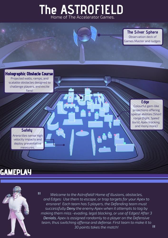
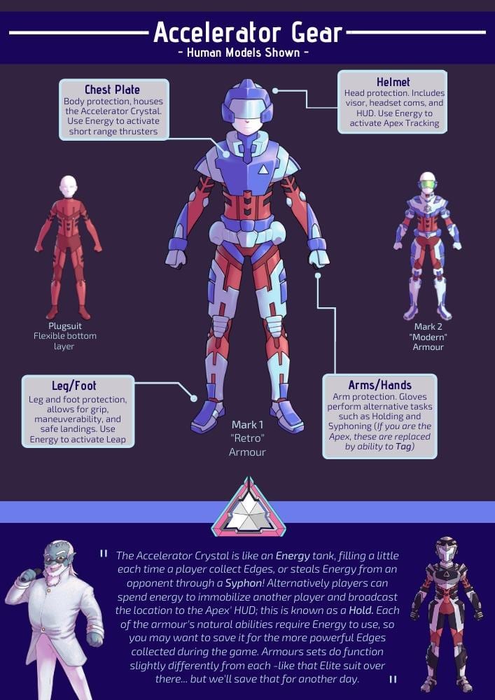
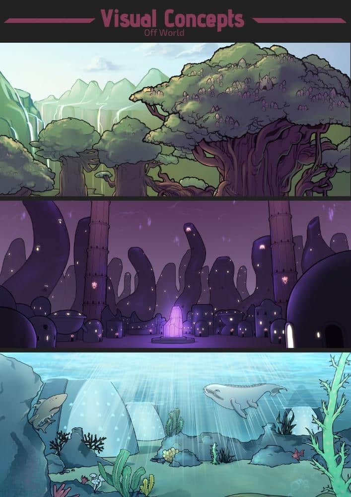
Pitch Bible Design for Animated Series
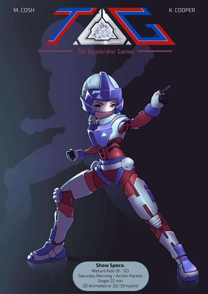
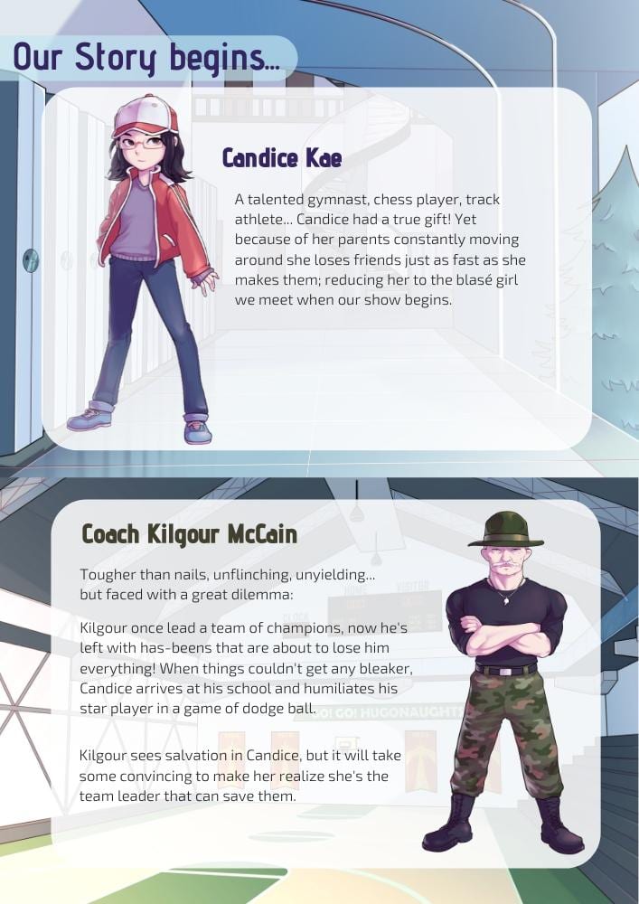
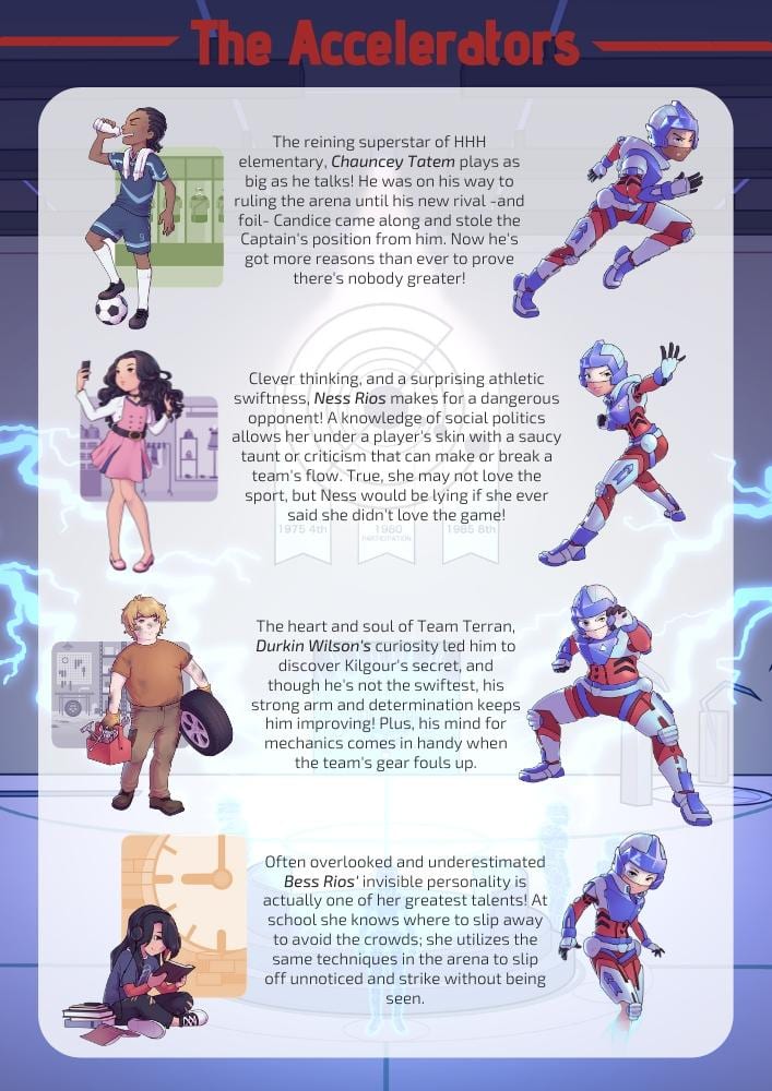
Mike was collaborating with his team to develop some illustrations for a creative animated project called TAG. Mike and his team had already put together some wonderful designs so we worked with them to put his illustrations into a multi-page Pitch Deck.
Since Mike wanted to be able to do some of the design work on his own, we introduced him to our favourite new design tool, Canva! We used Canva to find some different flyer design templates and started to arrange the assets he wanted to feature the most. We continued to go back and forth with design collaborations until Mike was happy.
The end result was this wonderful multi-page pitch deck that Mike and his team used to explain the concepts behind their animated series to many animation studios and project interests.


