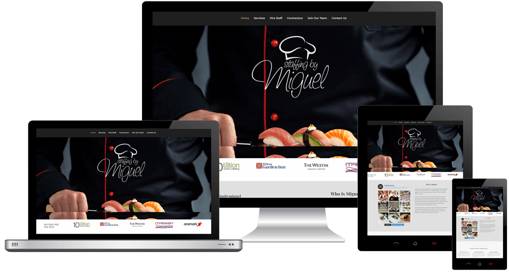
Meet Miguel.
Website Design Case Study for a Catering Company.
South Pickering Auto & Tire is an auto-mechanic shop located in south Pickering, Ontario. Like many professional automotive mechanics, SOPIC had done just fine without a website for many years. But when it came time to rebrand this business, SOPIC owner Richard Araujo turned to Grapevine Media to build a secure and modern website that would last the test of time.
Customer Reviews
%
Audience Growth

Website Design Case Study for Catering Company.
Meet Miguel.
Miguel is the owner and operator of Staffing by Miguel, an elite staffing agency for cooks and chefs in the GTA. His staff are amongst the finest in the catering industry and Miguel has been leading the charge for over a decade. After a few years of successfully building his company without worrying about his online presence, Miguel decided it was time for an update.
Customer Reviews
%
More views

Catering Company Goes Digital
When Richard’s growing auto mechanic business became too big for his original shop, he decided it was time for a change. Along with a new shop, some new team members, and a lot more equipment, Richard decided to give his business a new name. And that’s how South Pickering Auto & Tire (SOPIC) came to be.
As part of his rebrand, Richard turned to Grapevine Media for a new website and promotional video to help potential customers discover his new shop. The website would help customers to find the new shop, and the video would give potential customers a taste of the new shop.
Opportunities We Discovered
- Did not have a professional logo
- No website to generate leads
Logo Design for a Catering Company

When we sat down with Miguel to discuss his logo, he had some great ideas to create an elegant & professional chef-themed logo. After seeing a few mockups, Miguel settled on a cursive font with a chef logo for his catering business.
Website Design for a Catering Company

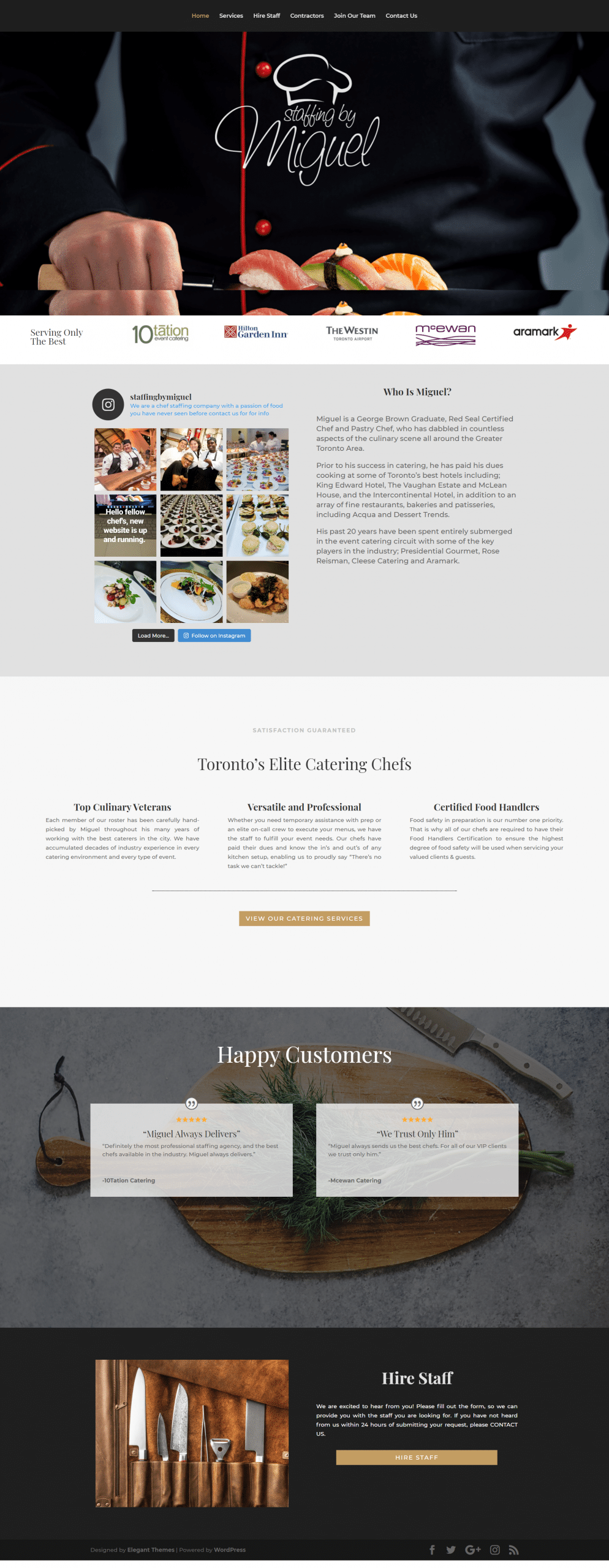
For Miguels website, we discussed at great length how Miguel would like to use his website, what theme/tone he wanted as well as what potential leads might want to see. We ended up with an attractive storefront site for Miguel that allows visitors to easily contact him for a quote.
Since he didn’t need to sell his services online, we were able to keep his site short and sweet. We designed each page with the intention of capturing contact information and directing the visitor to call or email Miguel personally since he was exceptional at closing most leads over the phone.


